Thursday, December 6, 2007

MOBILE PHONES!!!


FOUNDIT!! WILL FIND IT.
IN THE WALL FOR STUDS AND WIRES
OR UNDER THE GROUND SEEKING TREASURES OF DESIRES.
FOR THE SURVEYER,
THE BUILDER,
THE MINER'
OR EVEN JUST ME;
FOUNDIT WILL FIND IT
WHEREVER IT BE!

Monday, December 3, 2007

Here's Cheers


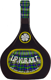
Malted whiskey, honey and Celtic spices is a taste that sure entices. A brew that will get you leggless and smashed to the hilt. So here's cheers to yur and here's lookin' Up.Yur.Kilt. An ancient recipe from the Scottish Keith clan. Produced entirely in Scotland, on the Muir of Fowlis, Aberdeen;in the Scottish Highlands. A very strong drop to warm you to your toes and give you a glowing nose. I tried to keep in with the clan colours but just overexarated the saturation. The pine crest on top of both bottle and packaging is of the Keith clan and translates to Truth Conquers. The little white rose is the clan badge, which is worn on the headwear or incorporated into the kiltwear and the sporran. I was going to make the box as a sporran, but after doing the bottle labels, found I need to flow it to the box without too much busyness or discontinuity. Kilts were first recorded to be worn from about the 13th century. Up until the 16th century, the kilt was actually made from about 3-4 yards of tartan folded in two. The smallest half was gathered or pleated at the waist and held together with a belt or leather strap. The larger half was then folded into a bag and then folded over the head,(forming a sort of hood), and folded around the shoulders and into the waistbelt. I've found out many interesting things doing this brief and learnt a lot about glue.

Monday, November 19, 2007

Jacqui - Red Red Wine

Appreciating good wine is one thing my family and I enjoy, so for us, I will be designing a wine label after our family name Archer.
When I buy wine I tend to go for the more classic style label, for some reason it comes across as quality, although I do like checking out all the new, more modern and contemporary labels and could be found guilty of buying one or two for the label,’ they were cheap though’, which is a good point, I would like to keep the design classic with a more simple modern twist, so as not to deter from quality.
Preferring red wine, I will probably design a merlot, keeping in mind that wine labels usually have to be adaptable to suit a range of reds and whites.
Having the name Archer I will be inspired by cherubs, archers, bow and arrows etc. and when I think of wine I naturally think of grapes yet I don’t see many on the labels and if I do they’re usually in a landscape painting of a vineyard so I would like to work with that.

Monday, October 22, 2007

Beer, Your friend in the fridge...

Firstly I will be creating a Beer Label with sales aimed at the 21-30yr old age group. I am thinking something Summery and Fun, with simple and limited colour.
I know my friends and I always look forward to what we call “Sunday Sessions” because these are the days of relaxing in the sun, buying a carton of beer to drink with good mates, and having good times.
I will draw most inspiration for the label design from beach like elements, eg: the sun, sand, waves, surfing, palm trees etc… just to give that feeling of Summer days and relaxation.


Cheers.

Saturday, October 13, 2007

Jess - Design Packaging Ideas


Good day!

Well for my design packaging I am thinking of going with something with a clean, elegant but strong design, for an expensive look. I would be targeting the age range of 25-35; a mid-age range can be more challenging because of the transsion of being a young adult and a more mature adult, though mainly aimed at the female gender.
I'm designing this brand to be sold only in Australia and be made in Australia because i believe the Australian market needs a few more elegant types of alcoholic beverages. The product will be a vodka mixed drink.

Thursday, October 11, 2007

I think i have to savour this opportunity and shoot towards packaging for a wine cask.
The ones that i tend to notice usually have illistrations on the packaging and was hoping to twist it around and do a more cartoony modern day illistration for the younger drinkers of the cask.

I'm not certain of a particular name yet or if i want to do a variation of an already existing brand.

I could call it "Shiny demon" :P

I would be aiming towards the 18-30 generation, i want the illistration to draw people in to some extent, even almost make it substitute for the horrible taste of some of them..

Thursday, September 27, 2007

genevieve- 'La Fee Verte'


I am intrigued by the intense emerald green of Absinthe and would love to design a label for this beverage. Its French name ‘La Fee Verte’ meaning ‘the green fairy’ serves as a symbol and lends it an enticing design element. Many artists living in Paris in the early 1900s would drink Absinthe and were inspired by it, many paying tribute to it in their artworks eg. Picasso’s ‘The Absinth Drinker’.
Due to this fact I am going to hand paint the Green Fairy to bring an artistic look to the bottle.
The hallucinogenic content of the medicinal Absinthe plant (Artemisia Absinthium) also known as the medicinal herb ‘wormwood’ which contains the psychoactive chemical thujone brought this beverage much controversy over the years as it was considered dangerous. The legal amounts are now written into countries constitutions and therefore is only rarely found in Australian bottle shops as you need a permit to sell it also due to its high alcohol content > 60 – 70 %. The wormwood is distilled with alcohol and without this process results in an extremely bitter beverage as it is one of “the most bitter substances known to man.” The intense green colour of Absinthe is actually chlorophyll extracted from other herbs such as Fennel and Anise. Absinthe should be diluted 3 or 5 water to 1 Absinthe as this makes the flavours blossom that would have previously been overpowered by the Anise (Licorice flavour). People often also add a sugar cube according to personal taste by using an Absinthe spoon, pouring absinthe over the sugar that sits on a Absinthe spoon lighting it on fire then dropping it into the mixture, although the major Swiss, French and Spanish distillers recommend drinking it without the addition of sugar as it only thickens the mouth feel of the drink and covers the delicate flavours. Often other herbs are also added such as Hyssop, Petite Wormwood, Angelica root, Sweet Flag, Coriander, Veronica, Juniper and Nutmeg.
Absinthe is quite an expensive drink ~$80 so I would like the packaging to live up to this. My approach to the packaging will make it legitimate as a gift. For this it would be sold in a box with sentimental elements such as a silk or velvet base for the bottle to sit firm inside, and an information booklet (serving suggestions) tied on with an ornately decorated green ribbon.


Wednesday, September 19, 2007

paula - aussie champas - cheers


Great how exciting, I love packaging... After seeing a news story last about how the new middle classes evolving in India, china and Russia are expressing there new found wealth by consuming huge amounts of french champagne. So much so that there is now a shortage world wide.

I will design packaging and labelling for a new Australian Champagne to take on the french and create a new source for the expanding market.

I am aware of the name champagne only being allowed to be used for alcohol produced in the Champagne region, however i dont agree with this law and so for this assignment i will disregard that ruling.

Tuesday, September 18, 2007

design packaging and labelling

design packaging and labelling for an alcoholic or herbal drink. post 100 wds describing your intended target market, profile and product. post and interesting link and image.

http://www.createawards.com.au/awards.php